Case Study · UKG Pro
Personalization at the scale of millions.
UKG Pro is the workforce management platform that employees use to see their schedule, request time off, review pay, and complete the small operational tasks that make up the rhythm of work. After the merger of Kronos and Ultimate Software, two legacy home experiences had to become one — for millions of users across industries, devices, and accessibility needs.
- Role
- Senior Product Designer
- TENURE
- 7+ years
- Platform
- Workforce Management
- Scale
- Millions of users
My Role
Experience strategy for a global workforce.
I led design for the UKG Pro home experience, working with product leadership, engineering, research, and accessibility teams. The home is the surface most employees see most often, which made it both the highest-leverage page in the product and the one most exposed to constraints — compliance, localization, accessibility, and the sheer variety of roles UKG serves.
Scale
Millions of employees, two legacy products, one experience.
- — Used by millions of employees across industries — healthcare, retail, manufacturing, public sector.
- — Unified two legacy applications after the Kronos and Ultimate Software merger into a single home experience.
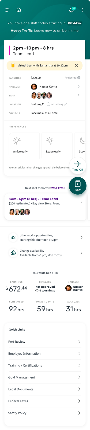
- — Redesigned the mobile experience end-to-end alongside the web product.
- — Designed inside a global workforce management context — multiple languages, regulations, and work patterns.
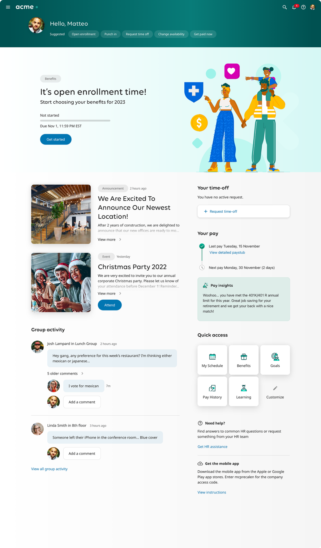
Challenge
A static landing page for a workforce that isn't static.
Workforce information is not equally relevant at all times. A schedule change matters more on Sunday night than on Wednesday afternoon. An open shift matters more to someone hourly than someone salaried. The pre-existing experience treated the home as a fixed dashboard, which meant users had to hunt for information that should have been waiting for them.
01
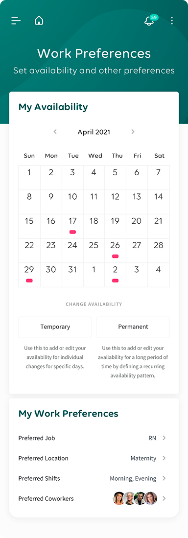
A context-aware home.
I designed a home that adapts to workforce context, role, current activities, and the moment in the week — so the most relevant information and actions appear first. The structure had to hold up across very different user types: a nurse mid-shift, a manager approving timecards, an executive checking headcount.
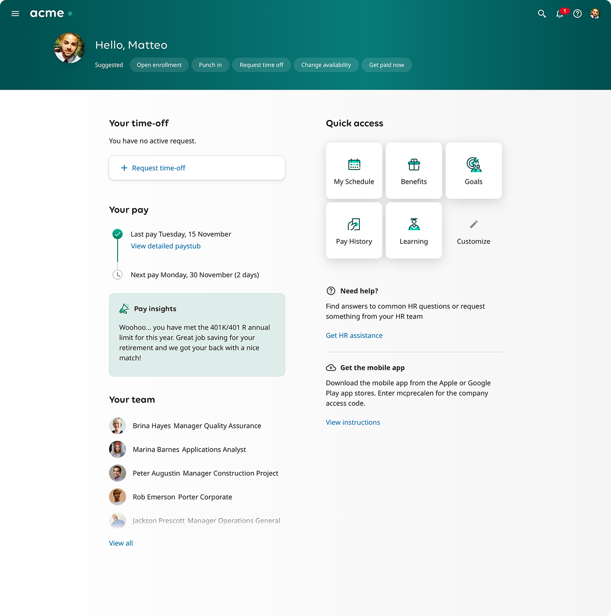
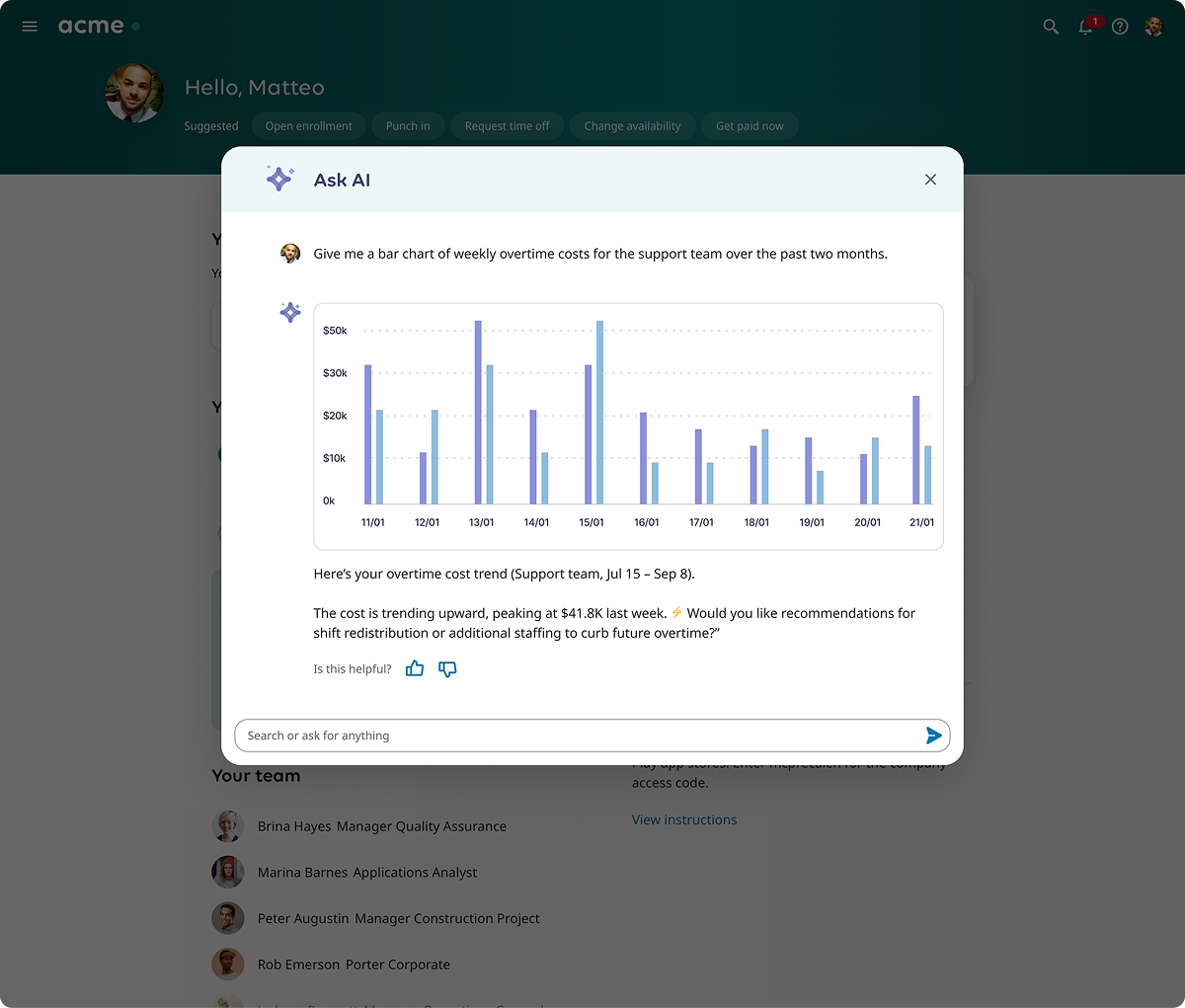
02
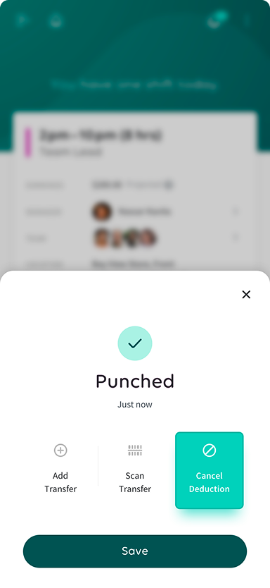
Personalization with UKG Bryte.
UKG's AI layer, Bryte, surfaced relevant alerts, recommendations, and actions inside the home. The design work was about restraint: deciding what AI-generated content was allowed to take attention, and what had to stay quiet so the rest of the page could be trusted.
03
Accessibility as a constraint, not a checklist.
At UKG's scale, accessibility is not an audit at the end — it shapes the structure of the page. I worked closely with the accessibility team on keyboard navigation, screen reader ordering, color contrast, and the patterns that would be reused across the product. Designing for the most constrained users made the experience clearer for everyone.
04
A foundation other teams could build on.
The home was also a platform decision. I created patterns and frameworks that other product teams across UKG could extend — so personalization, adaptive surfaces, and Bryte placements would behave consistently as the product grew.
Impact
Global rollout, faster work, better ratings.
- — Rolled out globally to millions of users
- — UKG Pro iOS climbed from the legacy app ratings to about 4.7★ with ~197,000 ratings
- — UKG Pro Android reached about 4.2★ with ~57,000 reviews
- — For reference, the legacy apps before the merger/redesign sat around 1.9★ (Kronos Workforce Dimensions) and 1.7★ with ~13,000 reviews (UltiPro Android)
- — Established patterns reused across the broader UKG product
Reflection
What the project taught me.
Designing for millions of people inside an enterprise product is a long-term game. Most of the work isn't the headline feature; it's the patterns, the accessibility decisions, and the platform thinking that quietly determine whether the next ten teams can build something coherent on top of yours.
Continue
About me